Wednesday, 18 December 2013
3 Sketch Proposals pinned up on Monday. I selected Tranformative - with the rather poor interim title of Snakes and Ladders, because tranformation is what is required in this area and my attachment to the planted river and the little Japanese influenced doodle that inspired it I did after having a good trawl through all my previous Japanese garden research. Lots more work to do and I knew before I went in that my tree strategy was really not finished and that I needed a lot more work on sequence and circulation.
Saturday, 14 December 2013
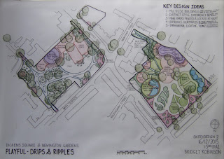
This was the state of play after last weeks studio session with Jamie and Julia. Top concept design is 'Restorative', I was thinking of the idea of a holiday at home and restoring the relationship between the people of the area and their parks.The second design is for 'Transformative' where a dramatic difference was my theme. I wanted to find a way to make the architecture of the surrounding blocks resonate with the park's lines and forms. The third is 'Playful', and for me this was a carefree doodle based of the concept of drips and ripples. Drip by drip the change will be made to the area, spreading like ripples.
Saturday, 7 December 2013
Working up the trace layers for Dickens Park.....I have found myself focusing all week on how I can get the locals out of their flats and into my parks. As far as I can see the locals have been badly let down by Southwark around Elephant and Castle. The exicitng promised plans for the shopping mall and the roundabout itself have vanished and the Heygate was one big series of ignored consultations & conveniently misquoted research results, which ended in the disaspora of almost all it's residents and almost no decent return for the people in the area. I feel I have to design something to help the locals heal their own community. It's all about building a neighbourhood identity, and creating a beautiful place where people can meet each other, work on things together for their own environment and EVERYONE is welcome, not just arty farty types and already empowered people who can easily end up setting the agenda. Social change through parks and streetscape. SO! My 'Playful' scheme for Dickens Square is centred around the motif of drips. Drip by drip the area can come alive. Plus it's great to be at the drawing board and not the PC!
Tuesday, 19 November 2013
Tuesday, 5 November 2013
Sketchup Model for Metis to work out the placement of the parterre pieces. I wanted them to start off overhead, like a straightforward iconic parterre pattern turned on its head. The dimensions of the pieces shrink further down the garden, adding to the illusion of receding space. Then the traditional forms begin to shift, twist and fall down, just as the culture, traditions and even language brought to the New World from the Old World are sometimes kept whole and frozen, immune from the natural development they might experience ‘At Home’ and others broken up and reused in new and different ways, their original meaning or purpose left behind or changed. This mixture of old and new is a reflection of the word Metis for me and tension between old and new. The pieces are intended at the back of the garden to almost filter away into the forest, their positions could be changed to allow trees to come forward into the design.
Metis model to explore how I wanted a somewhat monolithic front wall to control the view of the garden until entry though the doorway so as not to dilute the effect of the perspective trickery. I wanted this to recall the way these gardens were originally intended to be viewed from above, from a building. It also helped me to work out the exagerated foreshortening. First I distorted the broken up parterre pattern, narrowing it at one end, creating an optical illusion to make the garden stretch further away from the entrance than it actually does, then I placed in on an angle, higher towards the entrance, to add to this effect.I wanted the viewer to almost picture the vanishing point, and I think the last photo illustrates this. The model also helped to visualise the effects of the shadows on the ground, which were an important addition to this illusion. It did NOT help me at all with the placment of the broken parterre pieces. Trying to cut out the foamboard for this was a total waste of time, so I moved onto a sketchup model to sort this out.
Quick 2 minute sequential sketching following Jamie round the School of Architecture last week in a mob. I had to darken these up quite a lot so they were even visible whcih made me realise my linework is a bit vague and spiderey. I need to spend more time looking and then draw lines that people can actually see with a fatter pen.
Friday, 1 November 2013
I was fairly happy with my first attempt, but after talking through everything pinned up in the studio, we were asked to spend a further 10 minutes more on it for this week. I realised I could make it a lot more dynamic by overlapping elements, adding a splash of colour and moving the wording to prevent that rather static bottom right anchoring effect.
Saturday, 26 October 2013
Friday, 25 October 2013
Friday, 18 October 2013
Tuesday, 15 October 2013
Concepts for the Metis Garden Festival entry design
The first image is an initial concept sketch in class done while I was thinking about French Canada and how the traditions taken the from the old transfer to the new. Some traditions are proudly retained. Some disintegrate and fall away. I began with this D'argenville's parterre broderie design from which I took a few iconic shapes, creating a simplified parterre design, which I then started to break apart.
Tuesday, 1 October 2013
Client & Process Eye Level Persepective Views
These are some of the mostly sketchup created perspective views I did for my
school assigned client last year. I was quite pleased with the fact that I
was able to whip them up in an evening. Not so thrilled that my PC
decided that the application of shadows was a step too far. 20/20
hindsight: They are all a bit busy. I needed to spend more time in photoshop and give
them more life. Hopefully my new rocketship PC will help.
Client & Process A1 Plan & Aerial Views
I felt pretty happy with these two A1's in January, but I can see the
annotation is overdone on the plan view and although I wanted to convey
the essential woodland clearing feel that is the sites dominant
characteristic on the aerial view, I don't think the sketchup trees are
quite right, and they certainly use too much memory.
Subscribe to:
Comments (Atom)


